



In the fast-paced digital world of 2026, user attention is your most valuable and scarce asset. We often ignore how color affects our daily decisions, assuming that our purchases, or those of our clients, are purely rational. But what if I told you that your color palette might be silently sabotaging your sales?
At Damos Soluciones, we have empirically proven that color theory is not just an aesthetic choice. It is a fundamental discipline of neuromarketing, advertising, and interface design. A simple change in a button's shade can skyrocket your conversions or sink them completely. Whether you run a construction firm, a healthcare clinic, or an eCommerce store, mastering color psychology is mandatory for real digital success.
Table of Contents
What is color psychology and why does it matter?
Color psychology is the scientific field that studies how different shades alter human emotions, perceptions, and behaviors. Every color has an underlying meaning that deciphers how your audience will feel when interacting with your project's visual identity.
However, the same color can trigger different reactions based on education, cultural context, gender, or age. For instance, if you are targeting a corporate B2B audience looking for high-value services, black conveys prestige and authority. If you are targeting a younger demographic seeking wellness, a mint green or soft pink will evoke vitality and health.
We must make our audience feel a connection. Vision processes information thousands of times faster than text. The subconscious perception of your color palette will determine a large part of the user's initial trust and, ultimately, their purchasing decision.

The meaning of colors in marketing and UX (User Experience)
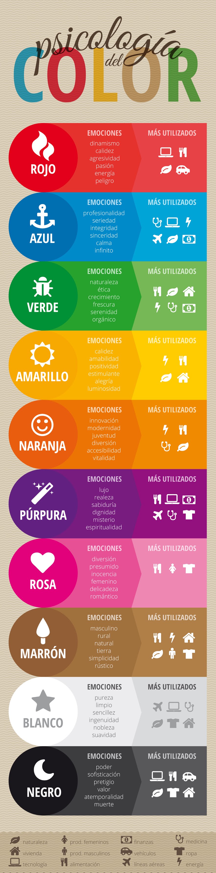
Below, we will break down the most relevant colors of the color wheel, their deep symbology, and how they are strategically applied in web environments. As society advances, perception evolves; what was a trend in 2019 now requires greater visual accessibility and technical contrast in 2026.
Meaning of the color Blue
 Blue is universally associated with
the sea and the sky. It is a relaxing tone that transmits stability,
calm, harmony, trust, and corporate security.
Blue is universally associated with
the sea and the sky. It is a relaxing tone that transmits stability,
calm, harmony, trust, and corporate security.
This is, by far, the favorite color of the vast majority of the global population. That is why at Damos Soluciones, we frequently implement it in institutional websites, insurance companies, or tech firms. However, if overused or applied in very pale tones, it can be perceived as cold or distant.

Meaning of the color Red
 Red is pure fire and strength. It is
highly visual and powerful, representing passion, energy, and urgency.
Red is pure fire and strength. It is
highly visual and powerful, representing passion, energy, and urgency.
In the digital marketing environment, red is vital because it calls to action at first glance. It is ideal for highlighting urgent discounts or alerts. Nevertheless, it must be used with surgical precision: a website saturated with red generates tension and visual fatigue, causing the user to abandon the page.

Meaning of the color Green
 Historically linked to ecology and
nature, green has evolved in the corporate environment to also
symbolize financial growth, hope, and profitability.
Historically linked to ecology and
nature, green has evolved in the corporate environment to also
symbolize financial growth, hope, and profitability.
It is a color that relaxes the eyes. We highly recommend it for web design projects in the agro-industrial sector, holistic health, or financial institutions wishing to project stability and a sustainable approach.

Meaning of the color Yellow
 Yellow represents youth, happiness,
and unbridled optimism.
Yellow represents youth, happiness,
and unbridled optimism.
It is a color that captures attention immediately, excellent for specific details. However, on large backgrounds, it causes a rapid visual fatigue effect. If you are going to use it, our technical recommendation is to ensure high typographic contrast (ideally with dark or black text) to comply with current accessibility standards.

Meaning of the color Orange
 Being a combination of the strength
of red and the joy of yellow, orange projects creativity, warmth, and
approachability.
Being a combination of the strength
of red and the joy of yellow, orange projects creativity, warmth, and
approachability.
In modern interface design, it is widely used to replace red in Call-to-Action (CTA) buttons. It manages to capture attention without being aggressive, stimulating clicks and, consequently, impulsive purchases.

Meaning of the color Black
 Black is the absolute monarch of
elegance, power, glamour, and technical sophistication.
Black is the absolute monarch of
elegance, power, glamour, and technical sophistication.
We use it deeply in projects for high-prestige brands, law firms, or architecture studios. Minimalism supported by black backgrounds with light texts (Dark Mode) not only stylizes the brand, but in 2026, it is a key trend for energy saving on OLED screens.

Meaning of the color White
 Associated with cleanliness, purity,
and simplicity.
Associated with cleanliness, purity,
and simplicity.
In the structural design at Damos Soluciones, white (or negative space) is our best ally. Its strategic use gives an absolute perception of spaciousness, allowing the content to breathe and the user to process technical information without feeling overwhelmed.

Meaning of the color Purple
 Traditionally linked to royalty,
luxury, and wisdom.
Traditionally linked to royalty,
luxury, and wisdom.
The challenge with purple or violet lies in the precision of the shade. A deep tone radiates luxury, but the wrong shade can visually cheapen your product. It is a color that demands excellent branding work behind it.

Meaning of the color Pink
 Transmits warmth, love, affection,
and care.
Transmits warmth, love, affection,
and care.
Depending on its saturation, it can range from a tender message (ideal for children's or personal care products) to a bold and modern statement (fuchsia pink) that breaks the mold in tech sectors looking for disruption.

Revealing data: The impact of color on sales
If you still believe that choosing colors is a matter of chance, consider these metrics backed by modern consumer science:
- Decisions in milliseconds: A user takes less than 90 seconds to form an opinion about a digital product, and color influences over 90% of that initial assessment.
- The Blue/Orange pairing: Have you noticed that major eCommerce sites use corporate blues with orange buttons? Blue retains the user by providing trust, while orange stimulates impulsive buying without the aggressiveness of red.
- The food industry and blue: Almost no fast-food chain uses blue because psychologically, it acts as an appetite suppressant. On the contrary, brands like McDonald's dominate with yellow and red—combinations neurologically designed to generate hunger and urgency.

Table: Amateur Selection vs. CRO Strategy (Conversion Rate Optimization)
In our web design plans, we leave nothing to chance. Compare the impact difference between a randomly chosen palette and a strategically optimized one:
| Critical Factor | Amateur Design (Templates) | Professional Strategy (Damos Soluciones) |
|---|---|---|
| Visual Hierarchy | Everything competes for attention; the user gets lost. | 60-30-10 Rule: Dominant, Secondary, and Accent (Buttons). |
| Accessibility (A11y) | Grey text on light backgrounds; completely illegible. | Contrast validated under WCAG standards to ensure total readability. |
| Calls to Action (CTA) | Same color as the background or logo. They go unnoticed. | Complementary colors that "pop" and compel the click. |
Practical tips for applying color theory in web design
To conclude, we want to leave you with golden guidelines that we apply daily in our strategies. In fact, one of the common mistakes in digital presence is visual inconsistency between your website and your social profiles.
- Less is more: Do not use more than 3 main colors. Saturation fatigues the user and kills conversions.
- Isolate your CTAs: Always use the same accent color, striking and unique, exclusively for purchase, contact, or registration buttons.
- Beware of visual competition: Look at the image below. When 4 or more intense colors compete in the same block, the human brain blocks out the cognitive overload.

To avoid these problems, at Damos Soluciones we always perform A/B Testing, pitting one button color against another so that data (and not opinions) dictates which palette best converts your visitors into real clients.
Frequently Asked Questions
Can a color change really increase sales?
Absolutely. A/B testing consistently shows that changing a button color from a shade that blends with the background to a high-contrast color (like green to red) can instantly increase clicks by more than 20%.
How do I know if my current website colors are right?
If your website gets traffic but no one fills out the contact form or makes a purchase, there is a User Experience (UX) problem. A professional diagnostic will measure if your contrast is adequate, if your CTAs are visible, and if your visual message aligns with your industry.
What is the 60-30-10 rule in web design?
It is a classic and effective principle where 60% of the space is occupied by a dominant color (usually white or neutral for backgrounds), 30% by a secondary color (frequently the brand's corporate color), and 10% by an accent color purely intended for interaction (buttons and links).
Are your colors turning customers away without you noticing?
Don't let a poor visual palette sabotage your marketing investment. Allow our UI/UX and marketing experts to analyze your brand and develop a platform scientifically designed to convert.
Request Strategic Design & Consulting